Good Behaviour Ice Cream
THIS IS A PERSONAL PROJECT
Good Behaviour Ice Cream is a pop-up ice cream shop in Toronto. There is a rotation of different ice cream flavours available on their online shop depending on the season and special occasions.
Something I noticed with Good Behaviour’s ice cream tub stickers is how the labels never display an ice cream flavour — it is always their logo against a solid colour background.
My primary goal was to highlight the flavour profile with the ice cream pint label.
Deliverables:
Illustrations, Label Design, Animation
Timeline:
June 2021 (2 days)
Brainstorming
To start off, I brainstormed and wrote down any considerations or assumptions I had about the project.
STYLE 🎨
I want the branding to be recognizable, even if I were to replace the central illustration on their current logo.
STICKER SHAPE ⚪
My assumption for why Good Behaviour doesn’t do custom label designs: cost-efficiency. It is much cheaper to print stickers than a label that wraps around the entire pint.
I want to ensure my idea can also be reproduced in a feasible manner, so I will create a design with the sticker restriction in mind. I will also ensure all stickers are the same shape as cutting uniquely shaped stickers would be more costly.
FLAVOURS 🍦
After following Good Behaviour for some time, I noticed there were some flavours which would regularly be available, whereas others might be seasonal or saved for special holidays.
My takeaway here is there is an opportunity to develop flavour-forward label designs for their regular flavours, and then potentially have some specially designed illustrations for their seasonal offerings.
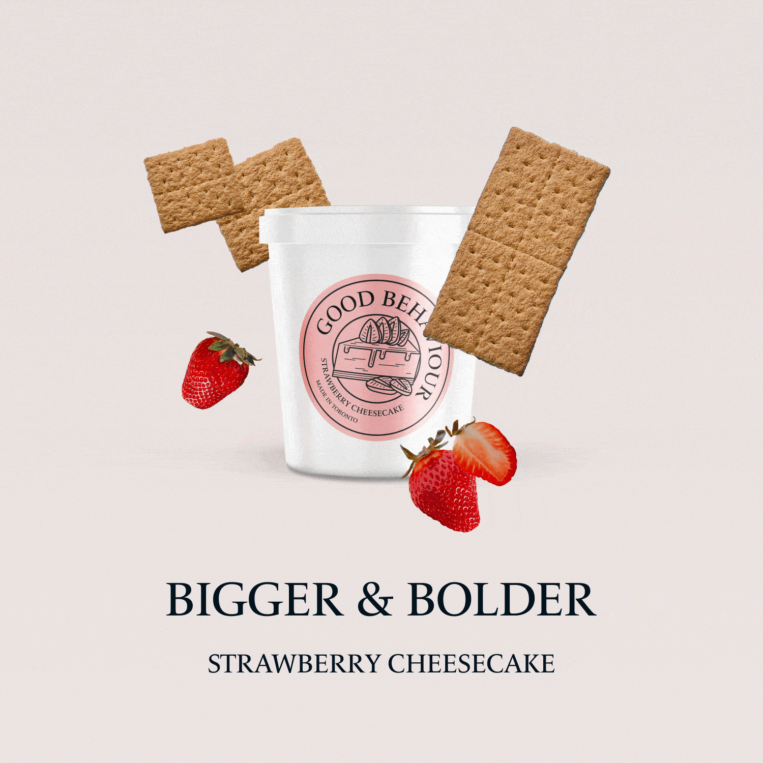
I decided to create designs for flavour profiles that were regularly available — strawberry cheesecake and Honey Nut Cheerios.
Redesign
Main Label

I implemented the retro line art aesthetic of the original branding to the illustrations I created for the redesign.
While maintaining stylistic integrity, I still wanted the main illustration to give a visual indication of the ice cream flavour. I made sure the object is large enough so that it is easily identifiable and that certain elements stick out of the circular border for visual interest.

Ingredients Label
The ice cream pints also have an ingredients sticker label on the lids. This sticker is quite simple — just black text against white sticker paper.
I wanted to incorporate this element into my redesign as well and elevate it by using colour and the illustration I made for the main sticker


Pint Mockups

To see how these newly designed labels will perform on actual pints of ice cream, I created these mockups:
Animation
I created a GIF that showcases the natural use of ingredients in the ice cream that Good Behaviour produces:
Final Thoughts
These designs would give workers and buyers a better visual indication as to what flavour the ice cream is inside the pint. Creating new label designs for all the existing flavours in the shop might be a large pivot from Good Behaviour's current branding. One idea is that these new designs can slowly be introduced through seasonal packs and such to make for a smooth transition.